This morning when Justin woke me up, my response was something like this... "Good morning darling, why isn't our overhead light centered in the room". He laughed at me. This is all part of being a designer. I live in a very nice apartment, but as a designer there are some things I just don't understand. The light placement in our bedroom is one of them. It is about a foot and a half from where it should be. To me if you have one overhead light having it centered in the room is common sense...right? Apparently not.
The second thing that makes no sense to me is the bathroom door. I believe our apartment was made to be an ADA accessible apartment. In my classes I've learned all about barrier free, ADA, and universal design. I think it's great, but I don't understand what the "designers" were thinking when making plans for this apartment. There are three foot doors...good choice. The bathroom door swings out rather than in...bad choice. I'm not sure if that is one of the accessibility standards, but in this case it makes no sense. The room is small, and there is really only one place for the bed to go. this means that it is impossible to open the bathroom door without hitting the bed, and the door cannot even open fully (which makes the 3 foot door completely pointless). No good. Sometimes it makes me angry looking at it... WHAT WERE THEY THINKING!
Problem #3. The first thing you see when you walk into the bedroom is the electrical box. Why oh why would the electrician do this. I'm pretty sure he's just playing a cruel joke on whoever moves in. There is a perfect place BEHIND the door where it would be nice and inconspicuous. But nope, it's taking up perfectly good, perfectly visible wall space.
I just don't get it.
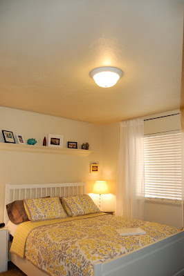
You may not be able to tell from this picture...but trust me..this light is awkward.

Trust me..it'd drive you crazy too.

The view when you first walk into the bedroom, and a lame attempt at trying to cover the electrical panel.
6 comments:
yes, these things make no sense!
ooohh, i am sorry! that would bug me so much! some people i tell ya.
i am guessing they were in a hurry... and didn't really care about the flow and aesthetics of the apartment.
I like how you covered the closet though! I never would have thought to do that in those apartments!
Aw, Jennie! I feel your pain!
hahaha. I work at a high end retirement community, and I was working with a maintenance guy installing a chandelier in a woman's apartment, and she was just being nit picky about everything.
After we left the maintenance guy turned to me and said, "What was her problem? Why did everything have to be perfect?"
I responded, "She's a designer!"
I agree. The light should be centered. Our house would drive you crazy. The sockets are in the middle of the walls - not on the floor - but on the wall where you can't hide them. Drives me crazy. And so is our electric box. Right above our heads where we sleep. I'm not a designer, but I feel your pain, even if just a little bit.
Post a Comment